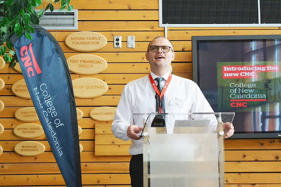
In his second day on the job, College of New Caledonia (CNC)’s new regional principal for Quesnel, Tim Lofstrom, helped launch the college’s new brand.
It was a big day, and one Lofstrom met with enthusiasm and a desire to encourage others to move forward.
“I’m really proud to be part of CNC and be part of the rebranding here,” Lofstrom told the crowd gathered in the college’s atrium to celebrate the launch of CNC’s new brand March 1. “For me in my new role here, I’m all about moving forward into the future, and it’s a very exciting time.”
Lofstrom told the crowd he thinks they should all be “genuinely proud of how we serve our community and how we respond to the needs of our community.”
“What I encourage everyone to do as part of my role as president is I want to encourage you to ignite what your passion is,” he said.
“I think those conversations we have every day are moving forward, building bridges and are a dynamic way to move people forward. What I look forward to is that sense of connection with everyone, to sit down and connect … and to leave each day from this college proud of what we are accomplishing.”
During the rebranding presentation, speeches were broadcast live from the Prince George Campus, and all six regional campuses were connected through video for the launch, a first for the college.
In a video, CNC board of governors president Gil Malfair acknowledged the hard work of Alyson Gourley-Cramer and the communications team, the steering committee and the operational teams who have helped extend the college’s visual identity.
“A project like this is highly a team effort across campuses and across departments,” he said.
Malfair says he was a member of the board when this project was first approved, and he had his questions about it, but he has no questions now.
“This project has really helped to characterize CNC,” he said. “This project is more than a new logo. It has involved the training of over 100 employees to date. Over 400 photographs were captured, new videos have been developed, and a new website will launch in May. In the past, we relied on stock photography to tell our story, but this project has allowed us to evolve. The board is proud of this new direction.”
CNC president Henry Reiser was skeptical too.
“Initially, I thought this was just a waste of money and wondered why would we go through this exercise,” he said. “But over the last 14 months, I’ve come to appreciate the collaboration that goes into a new brand. This is not a superficial project. I really believe it’s worth the investment.”
Reiser feels the new logo and new brand really connect all of CNC.
“CNC”s look was disjointed and inconsistent, and our visual identity didn’t match our reputational score,” he said. “Our logo had lost its meaning, and our output was inconsistent. CNC hasn’t rebranded since 2004, and we had a minor update in 2014, but most places don’t go 10 years without a rebrand. Research has shown visual identity is a big reason why people choose a school.”
CNC, which is nearly 50 years old, hired Léger Marketing to research its brand in November 2017 and discovered a disconnection between the college’s reputation and its visual identity.
Though CNC had a reputation score within its region on par with brands such as Shoppers Drug Mart and Google (81 per cent), only 45 per cent of respondents had a positive opinion of CNC’s current logo, with only 21 per cent thinking it stood out among other colleges, according to a press release from CNC.
One month later, in December 2017, the Characterizing CNC project launched with a goal to unify the college through a new visual identity, brand, and website.
Throughout the next 14 months, the college undertook a process that included interviews, collaborative workshops, feedback sessions, and steering committees with hundreds of current and prospective students, employees, instructors, alumni, donors, partners and stakeholders. All of that work culminated in the March 1 brand launch.
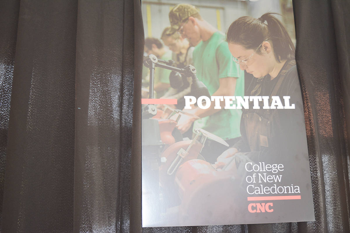
The pillars of CNC’s new brand are inspiring movement forward, bringing people and potential together, and nurturing strength.
“[The new brand] will permeate our decisions and affect our service delivery, and because it is the result of so many departments working together, it confirms who we are,” said Reiser.
Alyson Gourley-Cramer, CNC Executive Director of Communications, says CNC’s new logo is the centrepiece of the college’s visual identity.
“It’s a bold, contemporary word mark that still holds heritage,” she said. “Our colour palette is bold. The refreshed red is in much of the art of the 21 First Nations in our region. There is burgundy from our earlier logo. The bar in the logo … it reflects our connection to nature, it acts as a bridge between learners and instructors. It can also be a fun thing — fill in the blank. And it can emphasize and highlight.”
The new logo features a bar that is meant to represent what CNC considers one of its most important brand qualities — connection.
CNC says it is meant to inspire movement forward and connect people to potential.
“As we move away from our colonial past, you’ll see our new logo gives us the opportunity to replace “Caledonia” with words like ‘opportunities,’ ‘perspectives,’ ‘challenges,’” said Gourley-Cramer. “Our new logo gives us room for growth.”
The rollout of CNC’s new visual identity is a phased approach to signage and asset replacement, leading to a celebratory event in September for CNC’s 50th anniversary year.
As part of the rollout of its new brand, CNC will launch its new website this May.
“Coming here and being new to the campus, I fully believe in what the new logo means,” said Lofstrom.
“I think, together, we need to take up the challenge and fill in these blanks.”
READ MORE: CNC feeling positive